
Share this page


Configure table component
The table component is used to provide multiple records in a single field on a request. You can configure the table component to include multiple columns of varied data types. This component also supports rules for populating elements within the table and provides functionality for capturing column totals.
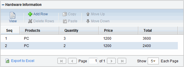
For example, XYZ Corporation creates a request type to request quotes and parts for hardware. Each entry of this type has the following elements:
-
Products
-
Quantity
-
Price
-
Total
To collect this information, XYZ creates a table component field labeled Hardware Information.
When the user logs a request for new hardware, the request displays the Hardware Information field. The user opens the Hardware Information window and selects a product, which triggers a rule to populate the fields in the Price and Total columns. He submits the request, which now contains all of the information required to successfully order the hardware.
Figure 5-6. Hardware information window
You can only add fields of this component to request types.
To create a table component field for the Request Details page:
-
Open a new or existing validation, see Configure validations.
-
From the Component Type list, select Table Component.
-
Type a validation name and description.
-
Provide any user instructions to display at the top of the table entry page.
-
To create the table columns, on the Table Columns tab, click New.
The Field window opens.
Define the type of information to store in that column.
This may require that you create a validation for the column.
You cannot use file attachments in a table component column.
Element
Description
Column Header
Provide a name for the table column.
Column Token
Provide the token syntax for the table column. For a list of all explicit entity format tokens, see Tokens.
Each column in the table component has an associated token. You can use these tokens in the same manner as other field tokens, such as for commands, notifications, or advanced field defaulting. For detailed information about referencing tokens related to table components, see Use tokens.
Description
Provide a description of the data held in the column.
Enabled
Select Yes or No.
Validation
Click the auto-complete button to retrieve a list of validations.
New
Click to obtain the Validation window so you can define a new validation.
Component Type
Displays the component type associated with the validation.
Multi-Select Enabled
Button availability depends on validation and component type. Select Yes to allow user to multi-select values for the field.
Attributes tab
Editable—Use to indicate if the field is editable or read-only.
Display Total—Use to indicate if the total for the column is displayed at the bottom of the table or not.
Required—Use to indicate if the field is required or optional.
Default tab
Default Type—Choose Constant, to provide a default value for the field.
Visible Value—Specify the default value for the field.
Storage tab
Max Length—Select the maximum length of the column.
Parameter Col—Select a parameter from the list of values.
Copy From
Use to query for and copy an existing column into this table.
OK
Use to close the Field window and save your changes after you finish adding columns.
Add
Use to save the column information and add another column.
Cancel
Use to close the window without saving changes.
-
When you are done, click Save.
Note: Starting from PPM version 9.12, a new table component is implemented to improve usability. You can switch back to the original table component layout by setting the server configuration parameter TABLE_COMP_USE_LEGACY to true. The default value is false.


